
Porting desktop applications to mobile platforms
Context
This personal project was started while I was still a Solutions Engineer at Datadog, we had a lot of demand for our logs product to be accessible on iOS and Android. I wanted to explore if the patterns and flows used in our desktop application could be adapted to a mobile platform.
The Datadog mobile app is only meant to be used when on call. It should enable engineers to quickly access their logs from anywhere at any time. The goal being to enable a fast response and resolution time to any production issues.
Log explorer
I initially focused on navigation, since this application is meant to be used when on call, there will most likely be a sense of urgency when accessing data, it's important for our users that they are able to find relevant information quickly and efficiently.
Log cell
The log cell is the main component that we use to display the most relevant information of a log :
the status (Error, info, debug etc…)
the log message
Some metadata, by default we will show the service name and the hostname, but these attributes should adapt depending on the service type (function name for serverless) or user preferences.

Explorer features
Before working on low fidelity prototypes of the explorer, the user flows were defined, taking inspiration from our desktop application and adapting it to mobile :
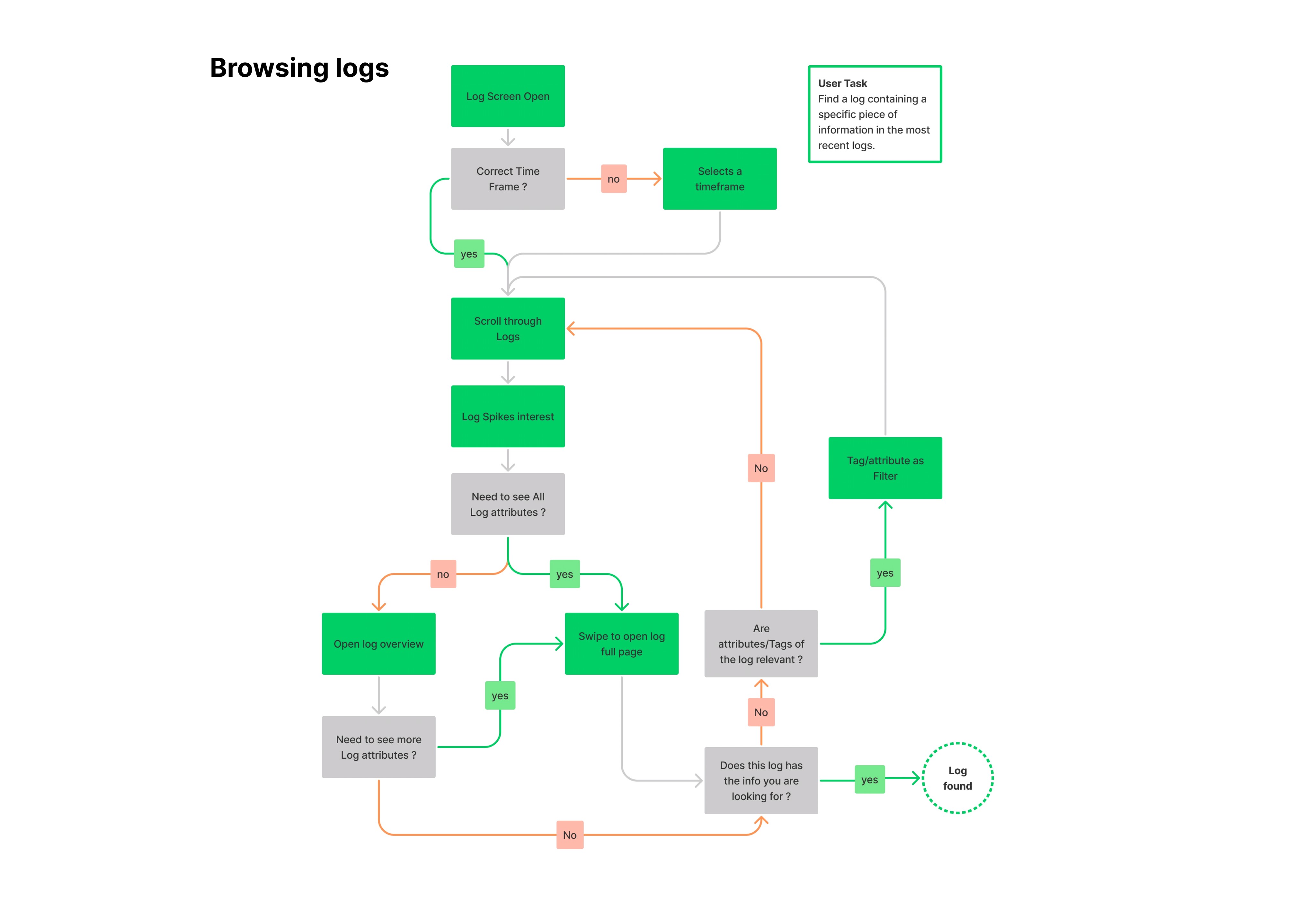
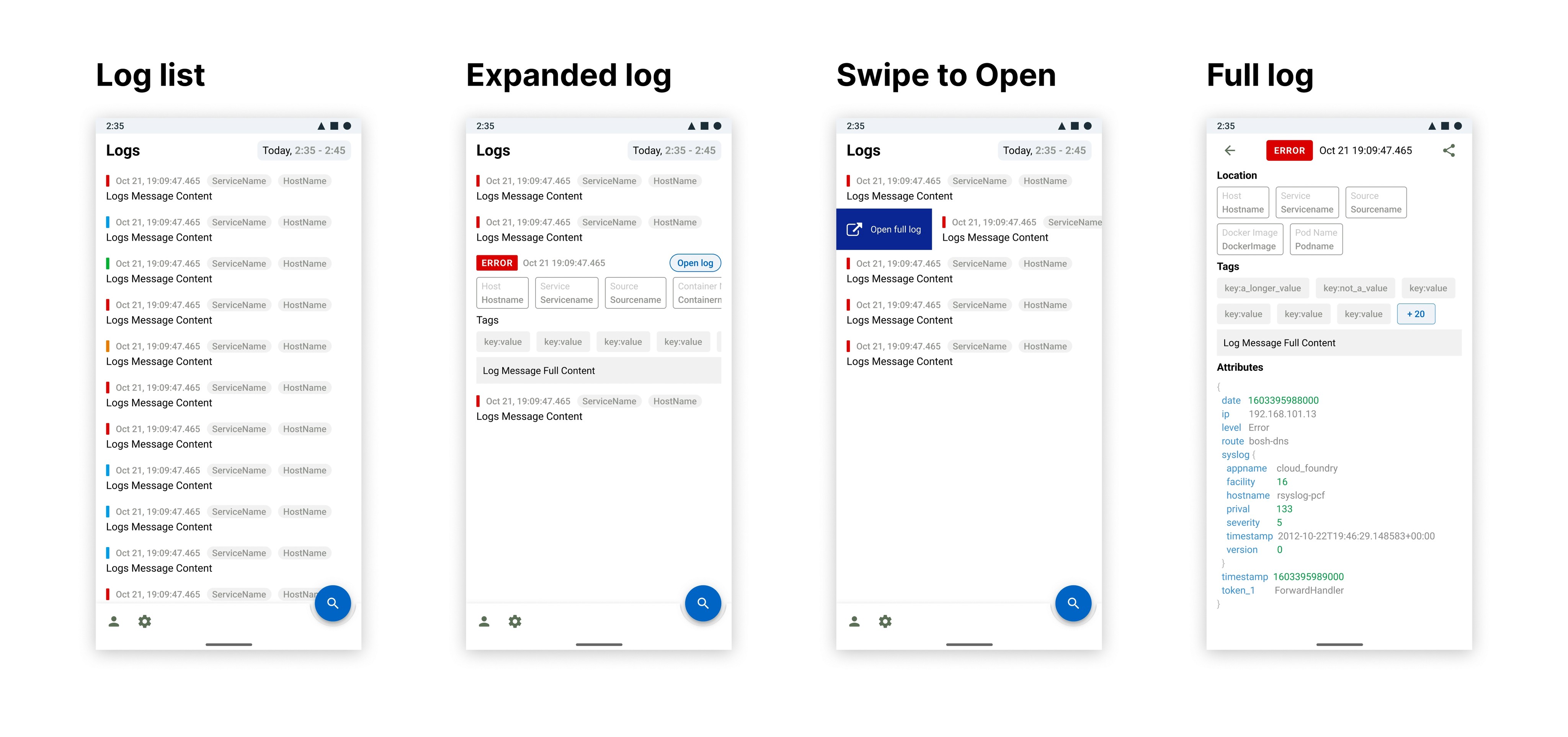
The tweaks to the desktop platform were rather minimal for the explorer use case, we did add some mobile specific features, for example, In the event of an Outage, It's likely that our users won't know exactly know what they're looking for, tapping on a log will expand it into a preview state which displays more metadata as well as the full message of the log. This is done without losing any context of the current search.
If the user wants to dive further into the log specific attributes, they can tap on the "Open log" button, Users can also directly open a full log by swiping on it. The full log page should display all the attributes of the log.
In context filtering
At any point on the search screen, users can filter their logs organically by tapping on any of the displayed attributes, this allows them to refine the search parameters by adding or excluding attributes as the investigation progresses (e.g it looks like this error is coming from this host, I only want to see logs from that host)

Date and time selections
Time gives a lot of context when investigating issues. It's essential for users to know when their logs were generated. Whether users are looking at the latest logs or scanning through past occurrences, we need to have a really good way for them to know what's the timeframe that they are looking at.
Covered use cases
A user is working from region A (UTC), their servers and their support team are located in region B (UTC + 5). This user wants his support team to access logs in region B as they suspect this server is the cause of an issue. This user should be able to see and specify in which timezone they want to input the time to avoid any confusion when browsing their logs.
E.g. ”We think we had an issue with our servers located in us east, could you check what happened there at 5am local time”
Date display
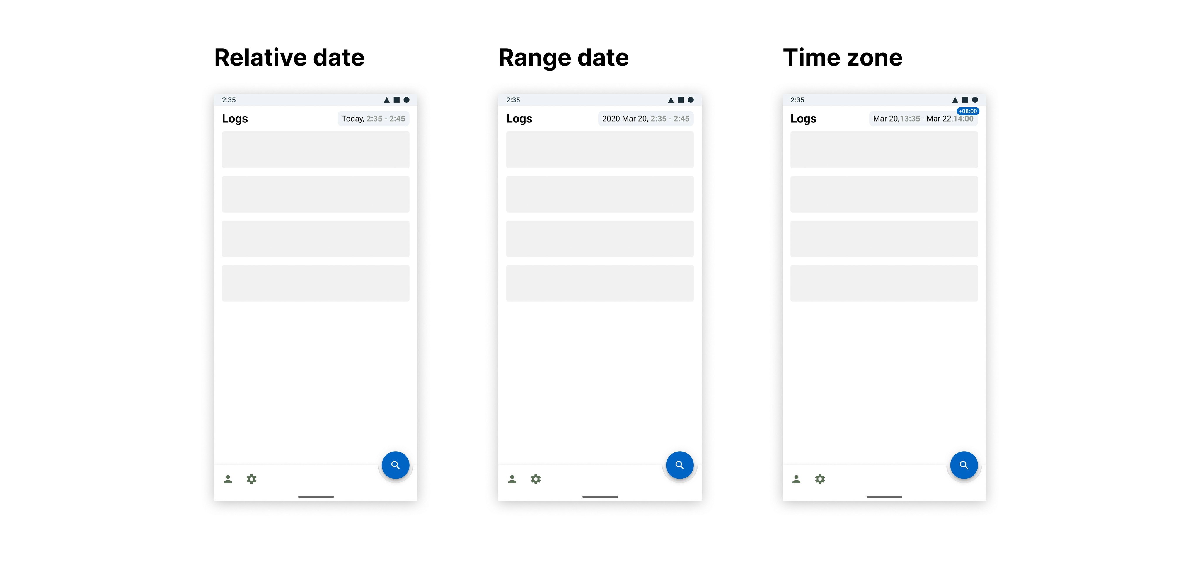
Date should be formatted relative to current time when possible (i.e. "Today", "Yesterday"). The date format should be very explicit, YYYY Mon DD, will be our default, but we should allow customization for different cultures. The current year can be omitted if it's the one selected to reduce the date footprint.
The timezone will be displayed in a high-viz pill when it's not the local time of the user, the local time can be set manually (different from the phone time) if needed.
Date selection
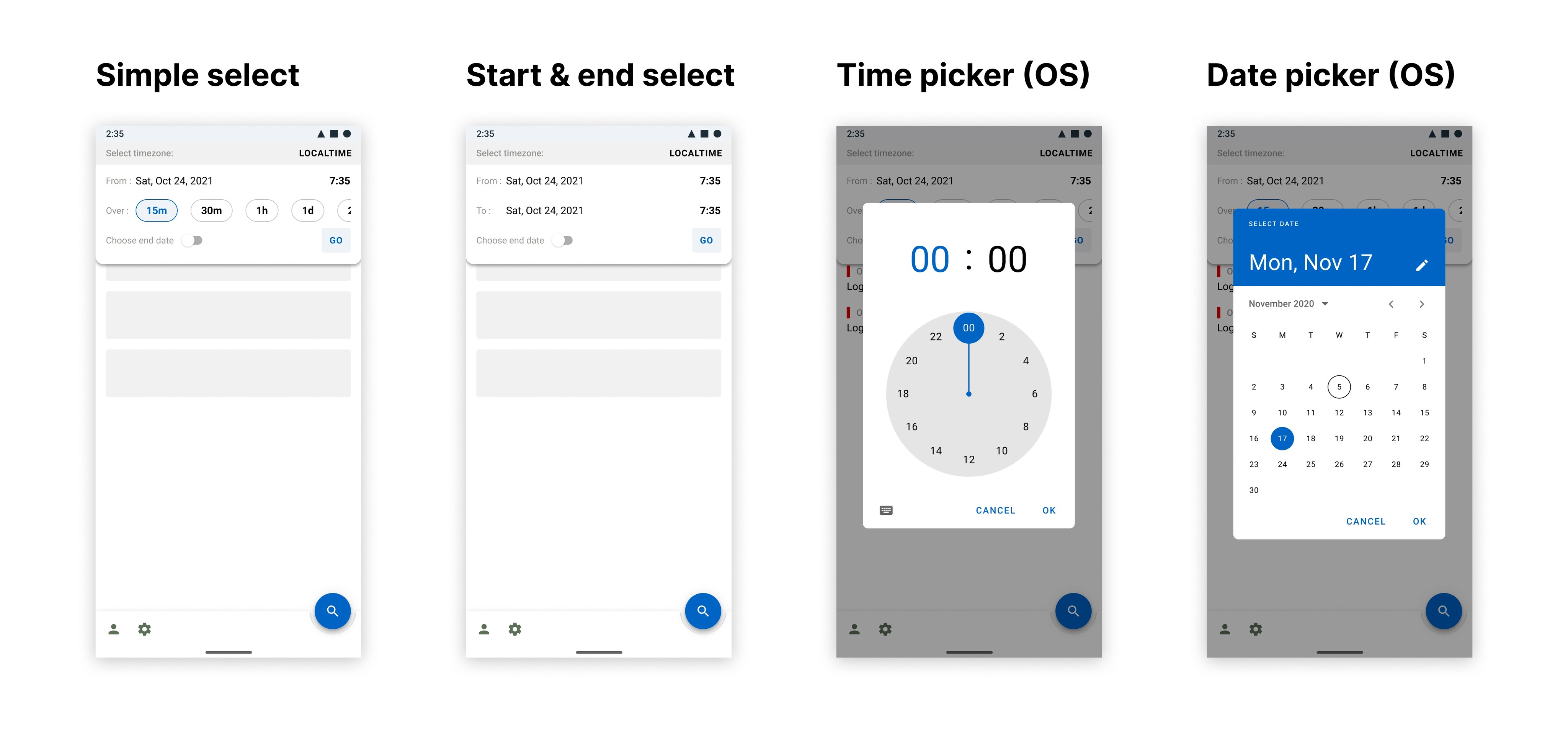
We have to differentiate two use cases when selecting a date and time :
The user might only have a rough idea of relevant timeframe, for example if they were getting the following feedback: ”our customers are saying that our app is extremely slow, we think there might be an issue but we are not certain when it started and if it's still ongoing”
The user knows exactly when they want the timeframe to start and end. ”our server stopped answering requests from 10:05 am PST til 10:15 am could you check what happened there ? "
We should accommodate for both use cases: we'll give our users a quick and less complex selector that relies on a start date and a period, however we will still grant the ability to switch to a more complex start and end date based selector, which would also be useful for selecting longer time frames (might be needed in the future for doing analytics over logs)
Search
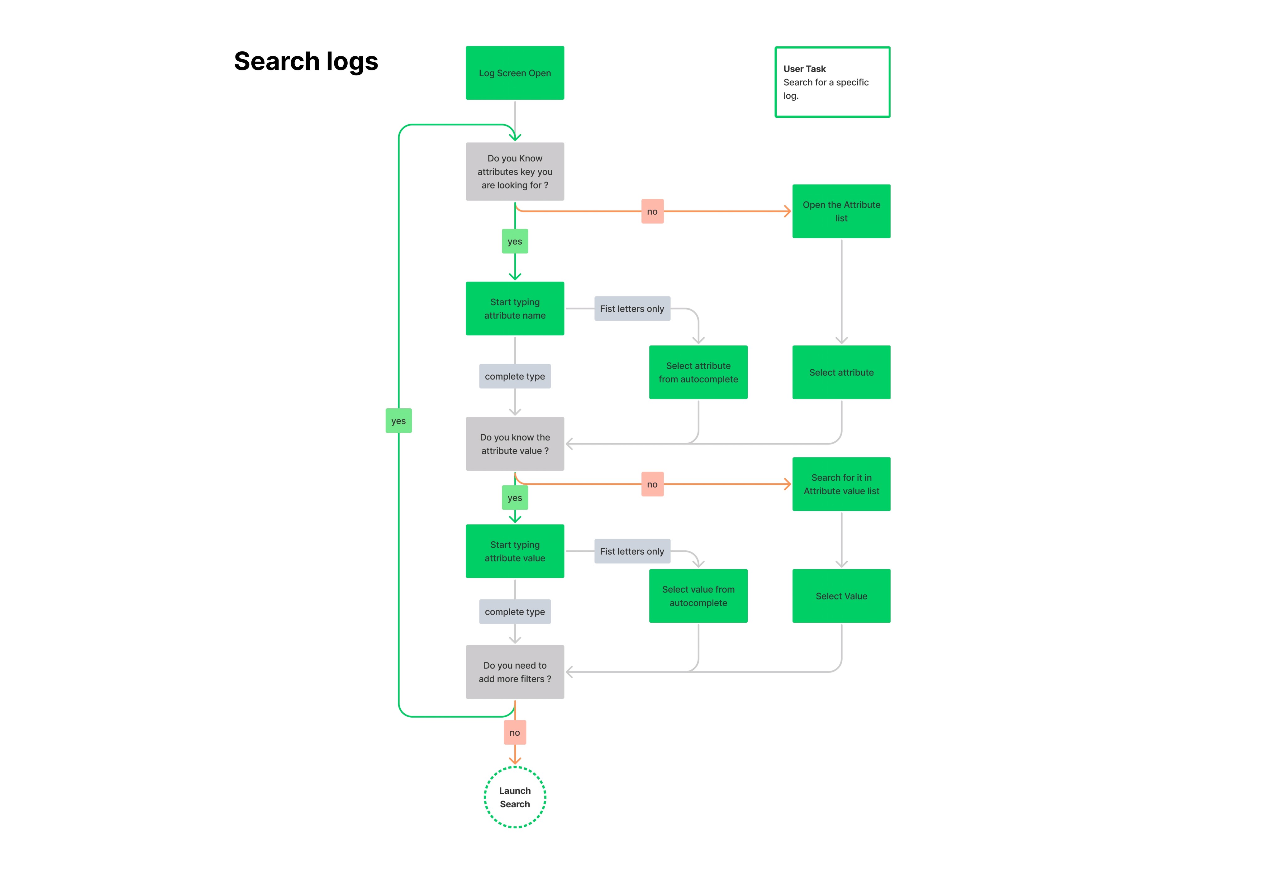
Logs can be extremely complex objects, with a lot of metadata associated with them, we need to give our users all the tools needed to effortlessly search through these logs, this is another part of the application that was designed with user flows:
Search use cases
The user knows where they need to look for their issue: E.g. ”An alert triggered on hostname_X the memory usage is above 90% let's check what's happening before it impacts our customers”
The user knows that the issue is only located in a specific part of their infrastructure: E.g. ”we have an issue with prod, please take a look at our logs there”
The user knows that the problem is not located in a specific part of their infra: E.g. ”I’ve checked us-east and us-west servers nothing is wrong there, could you see if everything looks right in EU”
The user knows what they are looking for but are not certain of the values that they need to select, they do not remember exactly how these are formatted E.g. is it web_store or web-store?
The user needs to look at past searches they already ran.
Key features
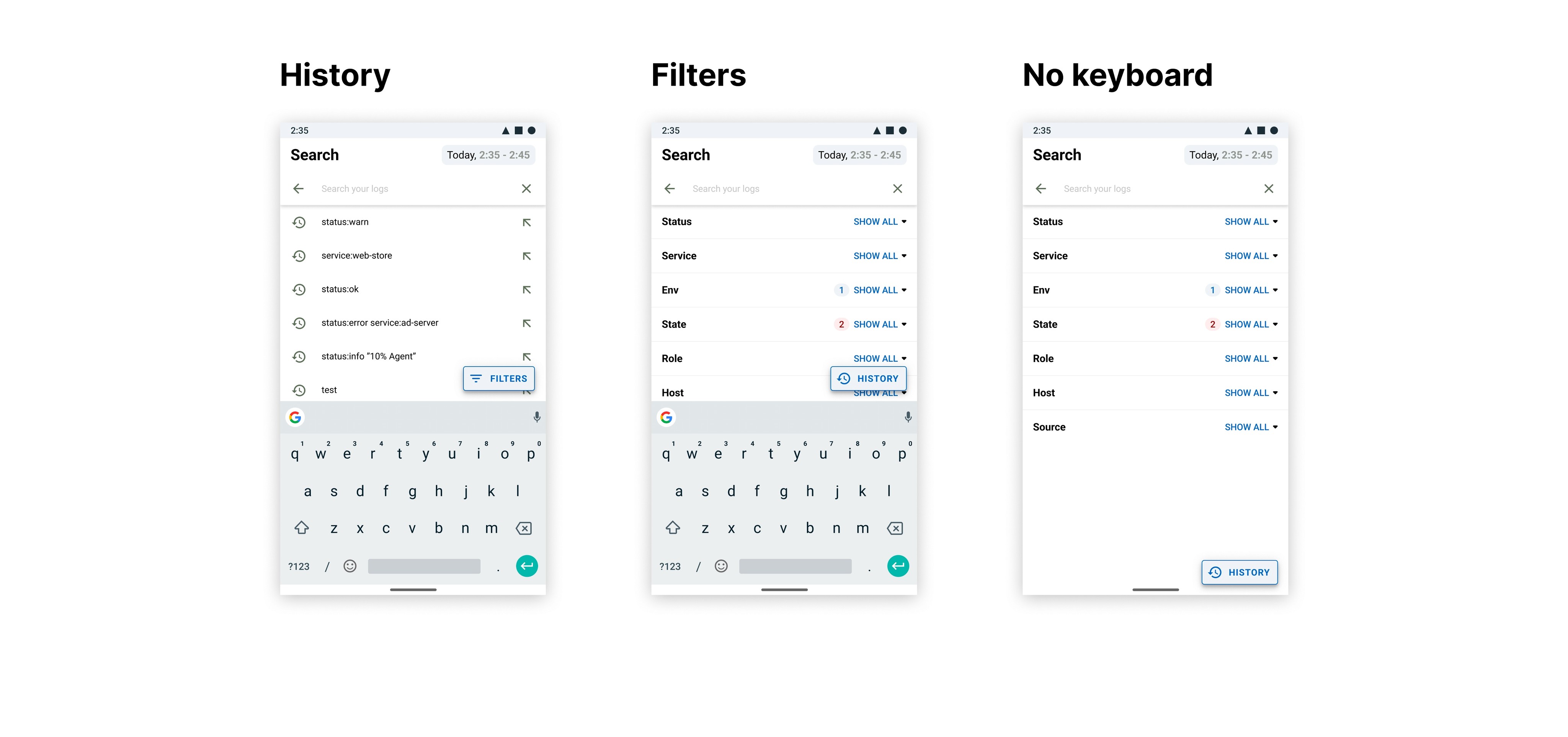
Displaying the search history as well as all filters on a single screen is problematic as our list of filters needs to be exhaustive, we think that it would be better to separate the two as it seems like searching through history and starting a new search are rather different use cases.
The Floating action buttons allows users to quickly switch between the two modes without having to close their keyboard.
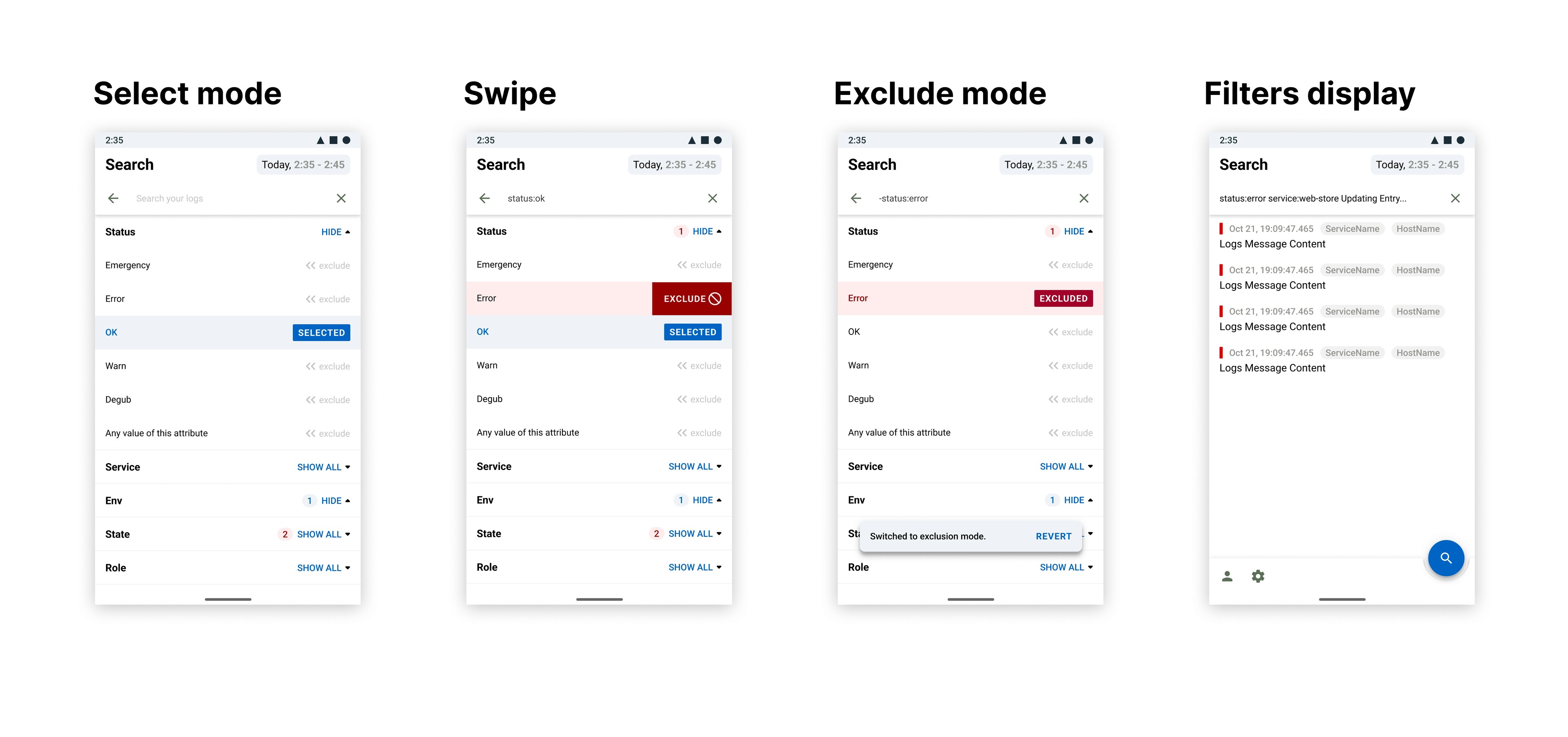
Filters should enable users to either select or exclude one or more values from any of the logs attributes. Excluding an attribute is done by swiping in the opposite sense of the reading direction, (e.g. for English this is left to right so you'd swipe from right to left). It's not possible to mutually select an attribute and exclude one, a toast is there to warn users that they switched from inclusion to exclusion mode for that particular attribute. Users can type in the search bar to narrow down the suggested attributes.
Dynamic suggestions
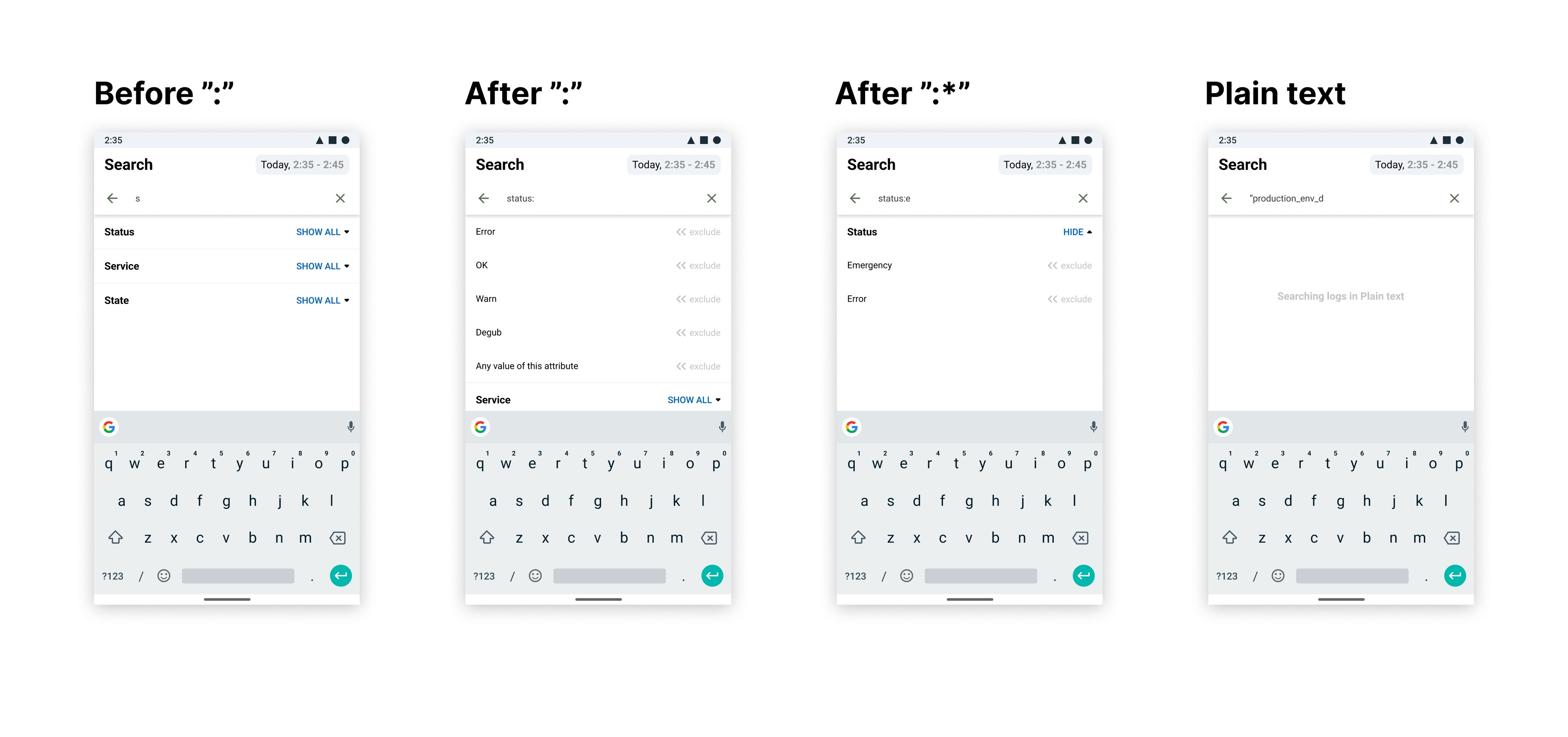
Suggestion will mostly work like most mobile search UI, however we do need to accommodate the dynamic search due to the format of the tags. Most of Datadog's tags are a key-value pair, separated by a ":" character, so we want suggestion to only match either part of the key value pair.
I.e. If the user starts typing "s" , we will suggest different values for the key such as "status", "service", "state". Once the users has typed the ":" character we will propose suggestions for the attributes of that value, for example if they type "status:" we will suggest "error", "ok", "warn".
If the user wants to run a plain text search (not using attributes) they can achieve that by using double quotes.
Conclusion
Porting a desktop application was a rather challenging exercise, it's complex to choose which features should make it into the MVP, and which will need to make it into later versions. This selection needs to be done while still keeping the overall experience coherent between the two platforms.
Even if a significant part of the features are already defined, porting an app to mobile is almost like designing a new application ( most of the users flows and use cases for will not translate smoothly) porting to mobile requires significant research work to translate the experience.
On a more personal note, The exercise felt a lot like translating text from one languages to another. When translating, it sometimes happen that the meaning of specific words cannot be fully translated, in this case, what is important is to keep the overall meaning consistent, instead of trying to make an exact copy of each sentences.
Gualtiero Mottola
Mar 2021