Visualize aggregate site analytics data
1) General context
This first section is not meant to be part of the case study, but rather to give you some context to fully understand the content presented below.
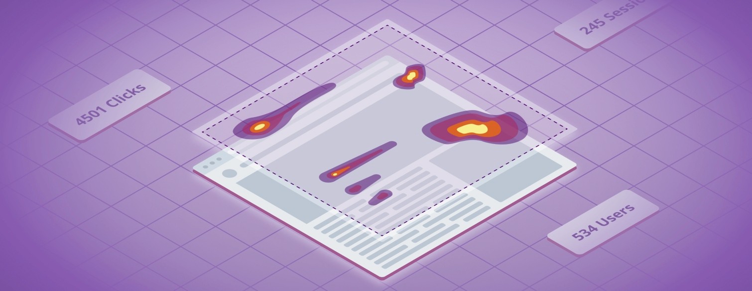
What are heatmaps ?
A heatmap is a tool that shows what part of your page is getting the most attention, there are several types of metrics that can be used in heatmaps, this project exclusively focuses on Clickmaps, which track users clicks on a given page.
What are heatmaps for ?
Heatmaps are usually used by product teams to help inform product decisions, for example, Heatmaps can help best understand where to place the main call to action on a landing page.
A bit about the team
I was the penholder for the heatmaps project, I was teaming up with Vanessa Cahill and Julie Ecourtemer for all rituals where more than one designer would be beneficial. On the engineering side, we were partnering with Julio Machado as lead and Milena Marković as IC.
2) The business aspect of this project
Our first step as a team is to define the business needs of the project, this step is owned by the product team, but as the design penholder on the heatmap project I participated in these meetings to make sure that I had full context when starting the discovery phase.
The outcome of the meeting is a product brief that's drafter by the PM and then shared with the team for comments, here are a few bullet points that summarise that brief:
The long term vision for Datadog is to be the single pane of glass for all application data, this includes everything that happens in the frontend.
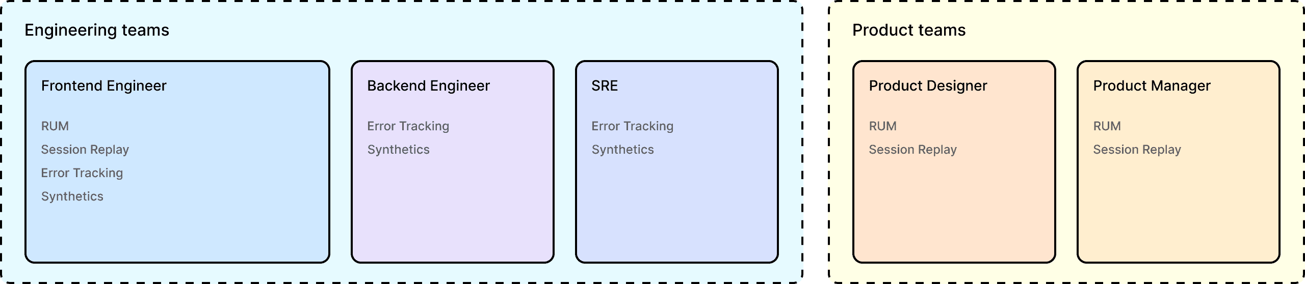
Datadog is already collecting a lot of frontend data thanks to it's real user monitoring( RUM) product, Since we are collecting the data we know part of the work is already done.
Datadog is, at it's core, a tool for engineering teams, which work closely with product teams, creating a product that targets product teams could unlock a lot of revenue for us:
It could push exiting customer to spend more money as we cover more use cases for more teams.
It could unlock some new customer that have little need for a tool to monitor their applications in the backed, but need an analytics platform.
3) The discovery phase.
In this section we'll give a brief overview of all the documentation that we created, and research that we ran before starting work on high fidelity prototypes, it is very important for us to make sure that we know what problem we want to solve and who we are solving it for. Our discovery phase can be split into the following steps :
Benchmarking our competition
Defining our user personas
Defining our user stories
Brainstorming potential ideas for heatmaps.
Defining our MVP
Defining our users flows
Creating and sharing low fidelity prototypes (first round of feedback)
Benchmarking
The first step was to understand who's our competition in the heatmap space. we want to know what needs to be done so that product is relevant against the competition. The main players that we selected were the following:
Our process was as follows : each designer picks a couple of products to analyse, we then share our key takeaways of the analysis with each other, this makes sure that we are all aware of the good ideas we find in each of these products.
Note: All the resources that we review for benchmarking were public in 2022, we did not create accounts on our competitors' platform to gain this information. The analysis was based on videos of the products, as well as documentation, to understand the features and functionalities that were covered by these products.
Defining our personas
Defining personas is essential to make sure that we build the right product for a given users, the definition process can be summarised like so:
And open ended interviews with our target personas user (internal but outside of our team/product)
Gathering and documenting insights from product managers
Using my product sense to draft our new personas
Sharing the draft and gathering feedback and iterating.
In total we defined 5 new personas, including 3 that would be our main target for heatmaps, you will find below the product manager persona which we thought would be the most important one to target.
The Product manager persona
The Product manager understands customer needs, brings products to market, communicates benefits and measure the performance of the product and usually has strong voice in it's company.
User goals: The primary goal of product managers is to identify new opportunities for growth and to drive the product roadmap towards that direction. They need to prioritize shipping new features that bring value to their customers, which helps to improve customer buy-in and satisfaction with their products.
User needs:
Extract actionable data from product usage.
Independently research the market and competition.
Understand the impact that changes have on their customer's experience.
Have the Ability to share data about product usage.
Get in touch with customers and extract valuable product feedback.
Pain points
Unclear requirement from key stakeholders and customers.
Lack of actionable product usage data to justify business/design decisions.
Unclear Forecasting and delivery timelines.
Changing priorities during spring.
Overwhelming product backlog.
Decision fatigue.
Tools usually needed by this role
Workspaces (Gdocs, Notion, Confluence)
Project Management Tools (Jira, Asana)
Presentation Tools (Gsheets, Powerpoint)
Defining Users stories
Users stories are a great way to build empathy for our personas, and to understand what kind of product we need to build to help them in their day to day.For this step our group of 3 designers starts by laying down ideas in Figjam, which I then summarise and share with the team, you can see two our our main user stories below:
As a Product designer, I aim to understand user behavior and improve the overall usability of my applications. To achieve this heat maps help me see changes in user behavior across different device types, compare different versions of my site, and understand where users are focusing the most of their attention or getting frustrated. This information helps me understand if a change improved the user experience, and helps me ensure that design patterns are being understood and used as expected.
As a product manager, I aim to make data-driven decisions to enhance my website. Heatmaps help me achieve this as I can identify which parts of my website are receiving the most attention and which ones need improvement. They also help me save time by analyzing data visually and presenting engagement data graphically. These actions will enable me to make better data-driven product decisions. Sharing a heat map can also help effectively communicate engagement information to key stakeholders.
Brainstorming

At this point we have gathered quite a lot of context on:
who we want to build the product for?
what user needs do we want to answer?
the next step is to generate ideas for our future heatmap product. Our brainstorming session consisted of the following steps:
A ideation session where all designers would lay down ideas, about features that could be included in the product
A grouping phase where we would group cards based on related features
A prioritisation phase, where each designers are given a set number of points (5) to assign to the ideas that they think would be the most impactful.
Defining our Minimum viable product (MVP)
We now believe that we have enough context to define our MVP, at this point we want to set goals and create alignment between the design team, the product management team and the engineering team. On the design side this definition really helps us know where we should focus our exploration effort.
This MVP takes into account the fact that Datadog already has a session replay product, which means that we already collect mouse position, clicks. scrolls of our users on a given webpage, the features that need to be aded to this already existing product to build a heatmap are the following:
Heatmap Generation: The ability to aggregate click data to visualize the user behavior patterns on a given page in any given state.
The ability for the user to filter the data based on parameters such as screen size, device type, browser, etc…
The ability to link aggregated click data to specific user session and link a user session to a heatmap.
Defining our user flows
The goal of the user flow is to have a basis from which we can start designing our lowfi prototypes, flows are useful we want to visualise how to cover multiple entry points into heatmaps. the user flows are focused on two use cases that are were essential to validate the MVP.
Generating a heatmap from a given page URL
Generating a heatmap from a session replay.
Low fidelity prototypes
We now feel like it would be a good time to share our plan for heatmaps with our key stakeholders, i.e. essentially with the group PM and the director of the user analytics product at Datadog, we thought that sharing lowfi prototypes in a flow-like form would be the best way to get
3) Hifi Prototyping & testing
Presenting high fidelity prototypes (second round of feedback)
User testing our prototypes
Handoff to engineering
QA + make sure that the prototype and the product matches.
Defining our user flows
Once we had defined who was our target and why heatmaps would help them achieve their goals we started working on low-fi and then high-fi prototypes.
In this section we will present what we believe is a mature solution to help our customers, the content that you see below is pulled from a design review to help align all major stakeholders.
Please fine below a video commentary of the prototype, each component is presented in more details in the following paragraphs
Heatmap header
The Heatmap header is split in two areas, the top section is used to select what data that we want to display, the bottom section is used to filter out this data, you can see a full overview below:

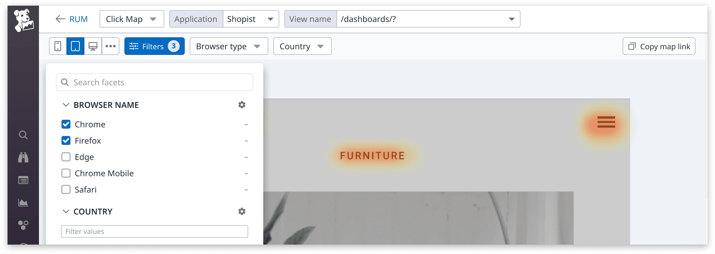
The bottom section contains filters that modify the data displayed on the heatmap. We have created individual dropdows for Browser type, Country, and Device size filters as all of our competitors use these. We think our customers will want to access them easily without needing to open the full filter menu.
Filters menu
The filters section contains what we call facets (essentially metadata that we use to filter events) to keep consistency with the rest of the platform. this also still allow customers to filter data on any of the facets they might be interested in. We will organize facets to display the most relevant filters first based on our competitive analysis. The pill on the filter button allows users to know at a glance if facets are actively filtering out data.
Side panel content
These panels works hand in hand with the map itself, when an hovering an element on the map we will highlight in the panels, the opposite is true as well. this behaviour helps build a clear visual connexion between the panels and the map. The Page Side Panel will display page-wide data, while the Action Side Panel allows customers to drill down into a specific event that was registered on the page.
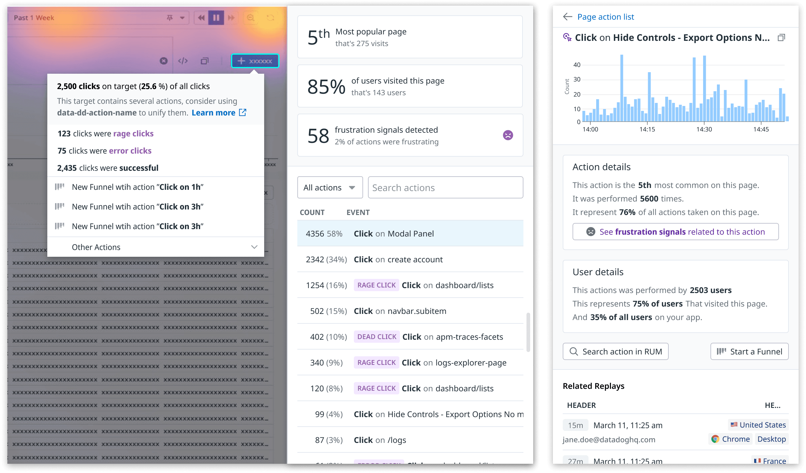
The Page Side Panel (left)
With this panel we want to put heatmap data in context to help our target personas make decisions. The to section of the panel enables our customers to understand at a glance the relevance of this page compared to the rest of the application, They should be able to quickly find:
The Importance of the page, i.e. how much is the page visited compared to other pages.
The percentage of their users that are visiting this page.
Whether their users are getting frustrated when visiting this page
The table also helps support the heatmap content: Users can narrow down the list by displaying only frustration signals or searching for an event name.
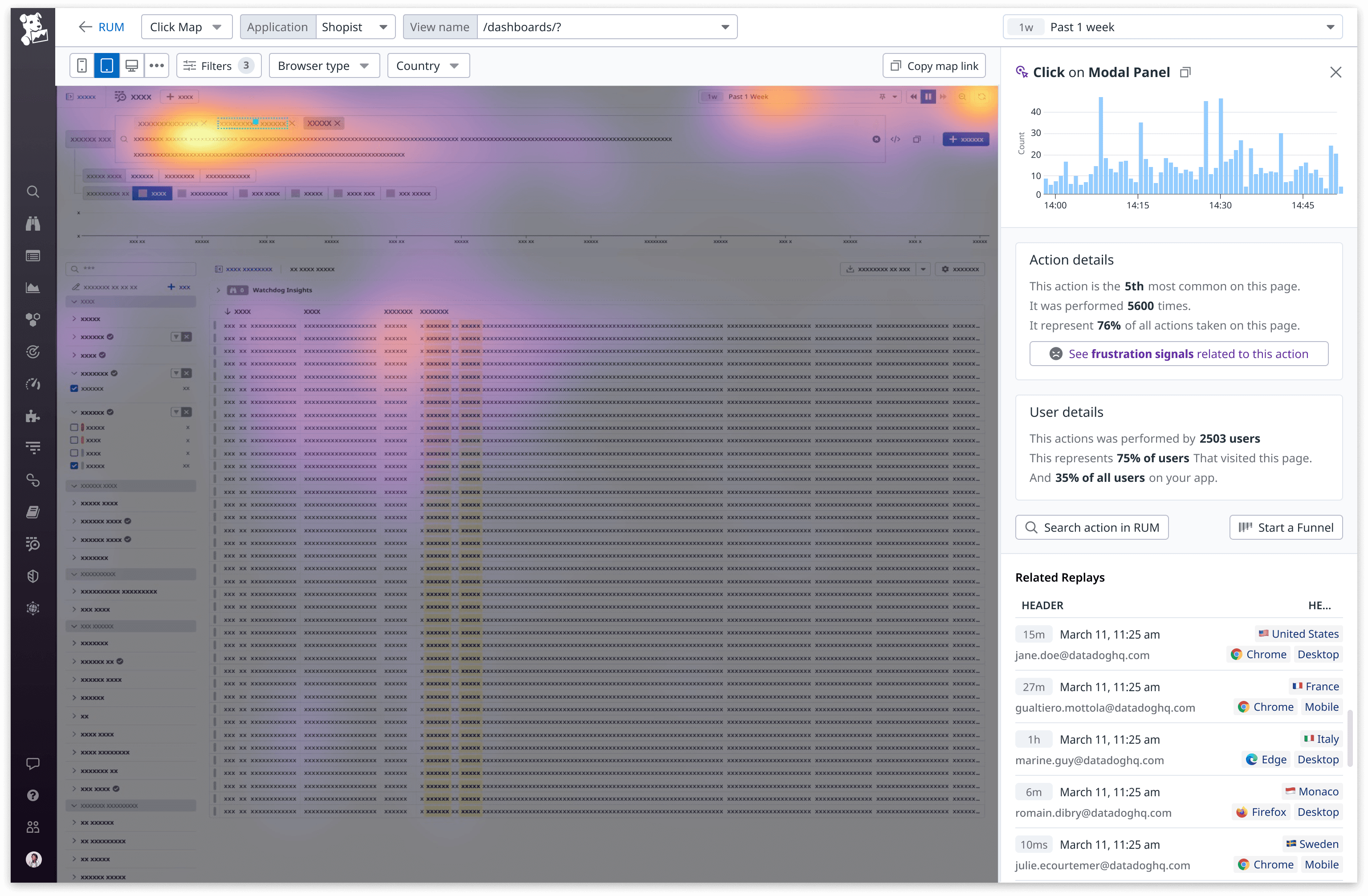
Action Side Panel (right)
The action side panel's goal is to clearly define the specificities of an event. The top level graph displays the occurrences of an action over the selected timeline, this should help our customers find out if a specific action is happening constantly or at specific intervals.
The "Action details" tile is here to explain in natural language the importance of this action relative to the page, This should remove the mental load from users that are trying to understand the relevance/importance of the action on this page.
The "User details" tile Explains in natural language the importance of this action relative to our customers user base, This Gives a good idea of the user impact of a frustration signal.
The links below these two tiles allows our customers to investigate the selected action further with RUM analytics or Funnels. finally the The replay list helps to gain qualitative understanding of user behaviour linked to this action.
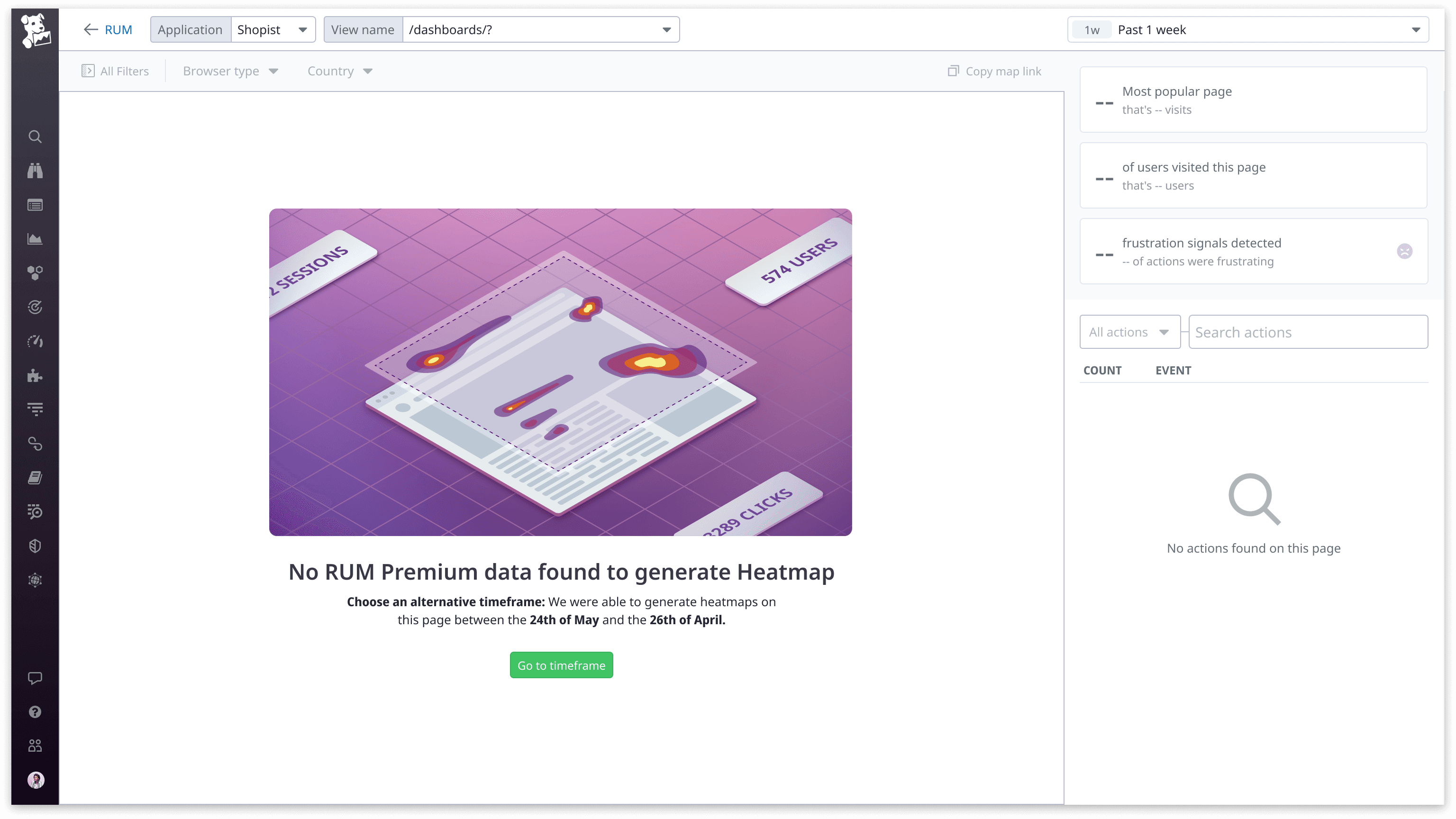
Heatmap empty state
It is very important for us to gracefully handle Heatmaps empty states, this is a rather complex dataviz product so we want to make sure that we are always transparent with our customers, we don't want them to get the feeling that the product is not working as expected.
In the example below the user selected a timeframe that does not contain any heatmaps data, there are several reason this might happen:
Customer is not sending RUM data data from the specified application
Customer is sending RUM data but Session replay is not enabled
Customer is sending RUM and Session replay data but the selected timeframe does not contain any, the data might have been sampled out or just not present in the first place due to low traffic.
We take into account each of these reasons and display an empty state that helps the user find a quick solution to their problem.
Usability tests
After showcasing the prototype to the entire team, we conducted both internal and external usability tests to validate its usefulness amongst our customers.
Objectives
Defining objectives for usability tests is essential was we need them to validate wether the test was successful or not, here are some of the key points we wanted to shed light on:
We are looking to see if users understand what they are looking at when landing on the page.
Vanity Metrics: are these useful ? Is there any other data that would be better suited for the main panel ?
Focus on Popovers, do these lead to where they expect ? Are there other information that that would see in these
Filters: do we like this new way of filtering ? Does it make sense for users that are already familiar with Datadog ?
Action list: Does it make sense for our users to isolate frustration signals ? Do users understand how to filter for a specific frustration or for all frustrated actions?
Action side panel, Do users see the need for the top graph, is it clear that it can be used for selecting a timeframe ? Vanity Sentences: do they find these useful ? Is there any other information that we could put there ?
Assumptions
Few key points that we used as a basis to come up with the design, we want to verify if these are correct:
Our target audience is less technical than usual for datadog, we expect to provide a lot of context to help make sense of the data.
Integration with the rest of the platform as well as sharing are really important for such personas.
Tasks
These are a snippets of some of the script that we used to run the usability testing. this was ran on a group of internal and external users, we interviews 15 potentials users in total.
Main page tasks:
Now from this page I'd like you to show the heatmap from users that come from (France) that use the (Chrome) browser ? and use an ultra wide display (wider than 1200px < *)
Now Let's say that you also need a very specific facet for your use case, you have a "campaign name" attribute on your session that targets a specific Google ads campaign. Could you show me where you would find that attribute ?
Now regarding sharing the heatmap ? How would you go ahead and share it ? In what format would you want to share this and with whom ?
Platform Integration
What part of Platform do you think you would want to jump to from this page ? Why would you want to go there ? What do you think you would do there?
Do you think you would want to jump to the RUM explorer from this page? What kind of visualization would you expect in the RUM explorer when jumping there ?
Regarding these metrics blocks on the top panel: Can you describe to me what those mean - what would you do with the information that's shown on there ? Would you say these are useful to you ?
Would you expect to see other information in this place ? Did you expect them to be clickable?Can you show me how you would filter out the list on the bottom of the panel to only display frustration signals. What else do you think would happen when filtering it ?
Now could you show me how you'd find the most common action on the page - not exclusively a frustrated one - and then dive into that specific action to get more details ?
Action Panel
Do you expect to be able to share this panel, how would you do so ? What do you think of the copy button, what do you expect this to copy ?
If you were to select a different time frame to focus on that spike we see in that graph, how would you do so ? Please describe what you’re seeing in the action details and the user details boxes - element by element.
Do you find the information in the action details and user details boxes to be useful ? Would you expect something else there ? Do you expect these to be clickable ?
Could you show me how you would jump to a replay that contains the action we are looking at from this screen ?
Could you show me how you would see all replays that happened on firefox from here.
Key findings from our research
Users really like the action side panel, they feel like the information is useful, especially the "action details" and "user detail" boxes. This is balanced by the fact that all the information can sometimes feel overwhelming, but we have to make a choice here and we feel like more info is better given our target personas.
There is no strong feel for the "export feature" screenshots are just fine it seems, most of the interviewees feel like in any case they will want to share the whole map via DD.
It's clear that the vanity metrics should be clickable but not so much what these should lead to. There is some consensus about the last button filtering the actions to frustrated ones.
Clarification on some of the wording for the main side panel, notably the points that came back are the following:
"Most popular" is not clear, popular compared to what ?
Clarify what does the 2% of users mean in the frustration signal, 2% of whom, what ?
Same for the 85% of users, which users ?
The session replay list needs a bit of work, most importantly It's really not clear what the tags in the replay list do.
Outcome of the research
We implemented some of the tweaks mentioned above, we started with the low hanging fruits that were related to wording clarification, we also choose to tweak visually the vanity metrics button to have a better hover state that would show where these button lead.
Technical Challenges
This will be a brief overview of the issues we encountered during this project and how we worked around them to still provide a good user experience.
One of the main challenges with building a heatmap product is that we do not always have a good way to tell which state the target page is in. This is especially true for single page applications. The example of this problem can be explained like so:
The user of a Single page application clicks on a button
This button opens a side panel (or modal) that does not modify the URL.
The content of the side panel is loaded asyncronously
In this case, it is hard for Datadog to tell when exactly the content of the side panel is fully loaded, so it's equally hard for us to display a heatmap of the page with the side panel in a desirable state.
It turns out that this problem was encountered quite often by our client as they run complex SPAs with a lot of different states under a single URL, this represented a huge challenge on the design side as the ideal solution would require a absurdly long dev time that we simply did not have.
After testing and long discussions with the engineering and design leadership, the solution that we came up was as follows, we create a "change background" button that allows customer to simply cycle through different states of the page, we also made sure to create a link from the session replays to the heatmap, as this would allow customer to properly select a very specific state of their page.
These two solutions were not ideal UX wise but we did find that in most of our testing it allowed our clients to find their page in the state that they desired.
Conclusion
In total, I worked on the heatmap project for about two years:
6 months of work before beta release.
1.5 year after the beta where we kept revisiting the product for further improvements.
Heatmaps was the one project that I carried throughout all my product designer role at Datadog, here are a few bullet points that summarise experience as the product designer of the project:
It was eye opening to define our new personas and to see how our current product was not built to address their needs. It really showed us that technical and non-technical users have very different expectations when it comes to tooling.
We were working on a highly complex product that very few players in the industry were building the way we were : we had to find new solutions to problems that no one had solved before. This project really stressed how important the relationship between designers and engineers is, and that compromise is often the best way to get to a working solution that answers your users needs.
Stakeholder management was key in this project, there were a lot of moving parts and teams involved in its conception and development, we probably would not have been able to release heatmaps without our monthly check ins with our group PMs to get buy in from leadership regarding the time that we needed to build the right features.
Gualtiero Mottola
2022